MAP3 Design System
Navigate through the library used
to build the MAP3 Application
Buttons
Buttons trigger a single action. Buttons for MAP3 are used for key actions,
like submitting a response, making a change, purchasing tickets or progressing
to the next step.
Types
Here are the variations of buttons designed for MAP3, crafted with a focus on intuitive user interactions.
To ensure familiarity and reinforce user expectations, we employed specific color associations:
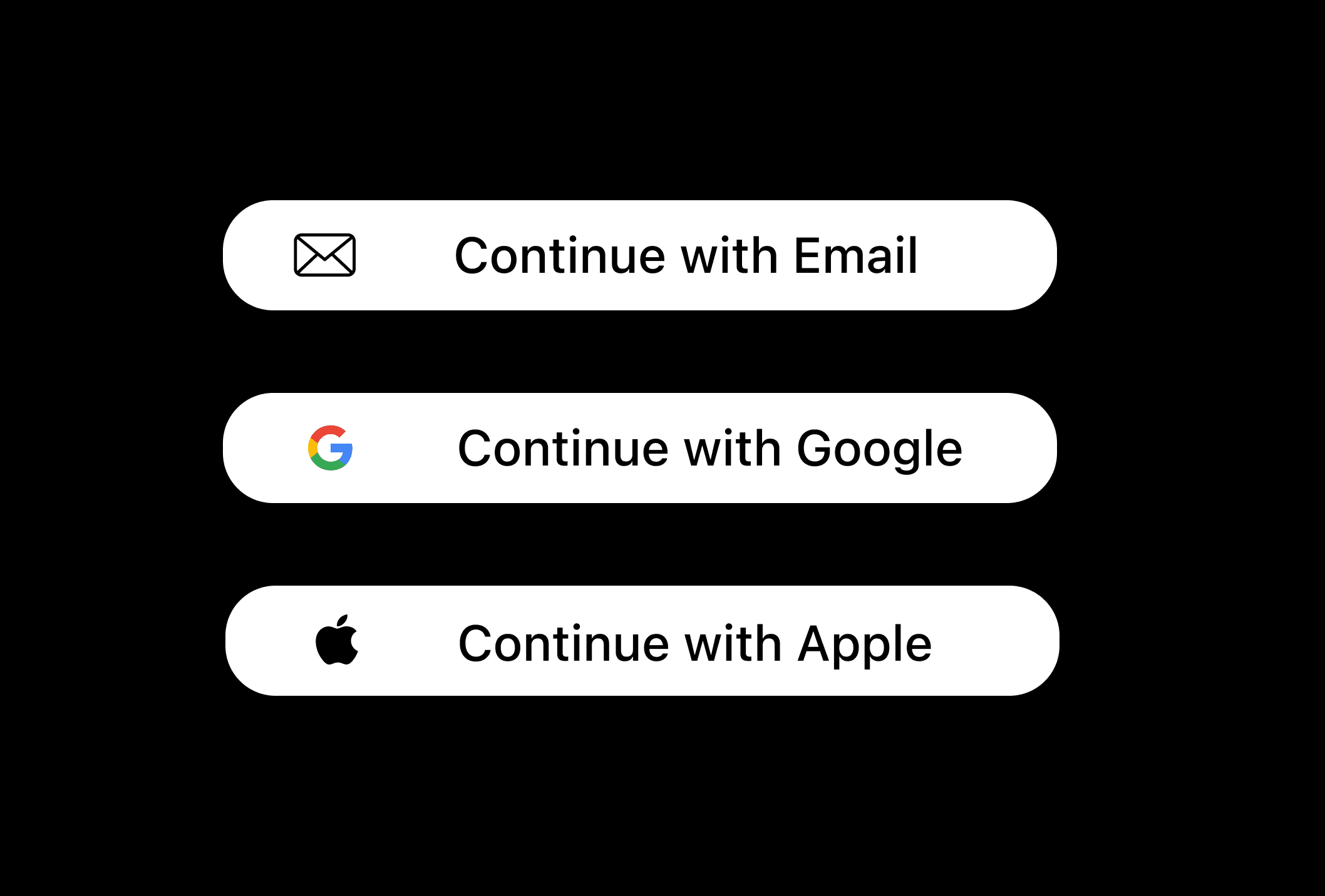
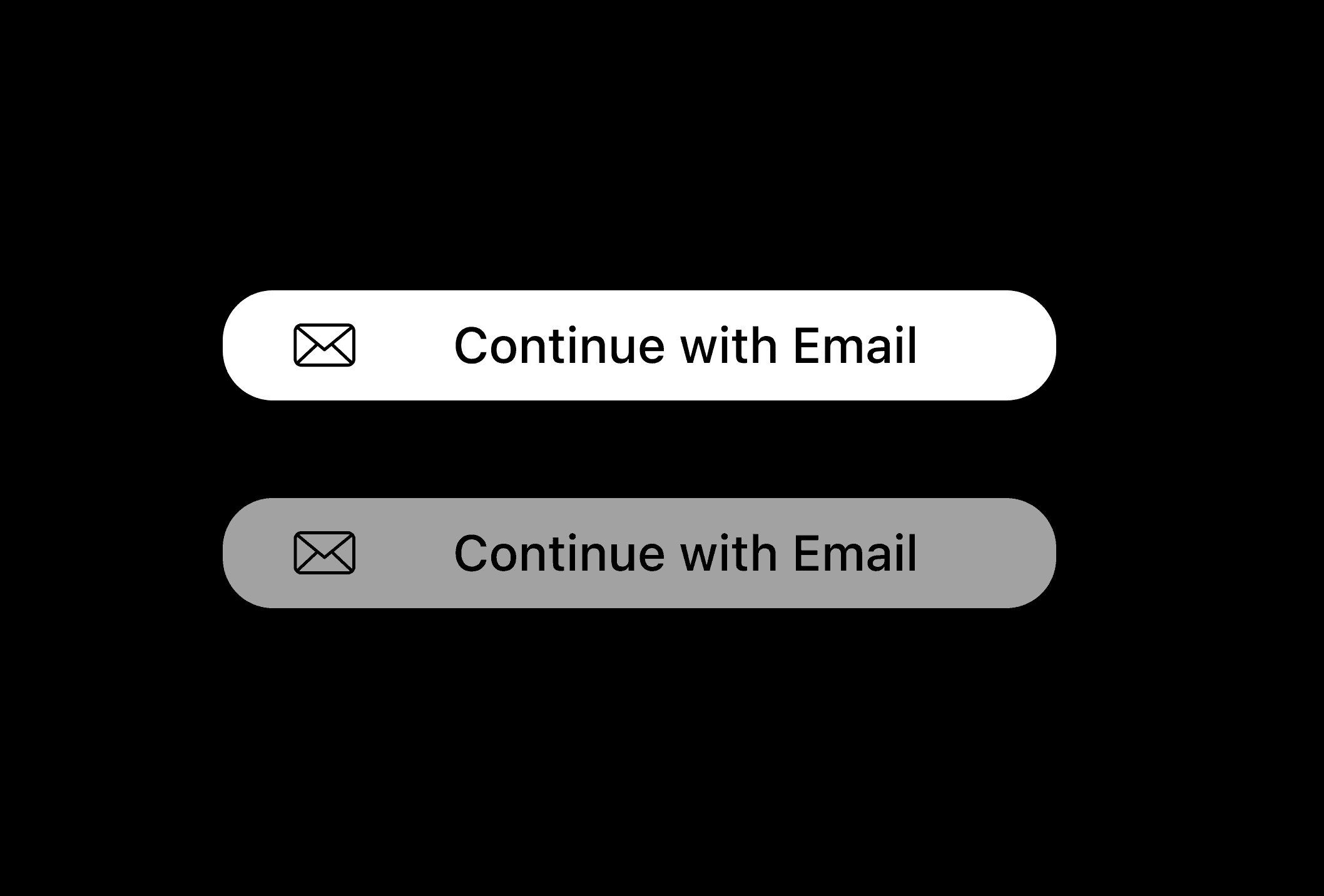
-Sign-In with Email, Apple, or Google options were designed with clean white buttons to ensure
simplicity and a seamless experience.
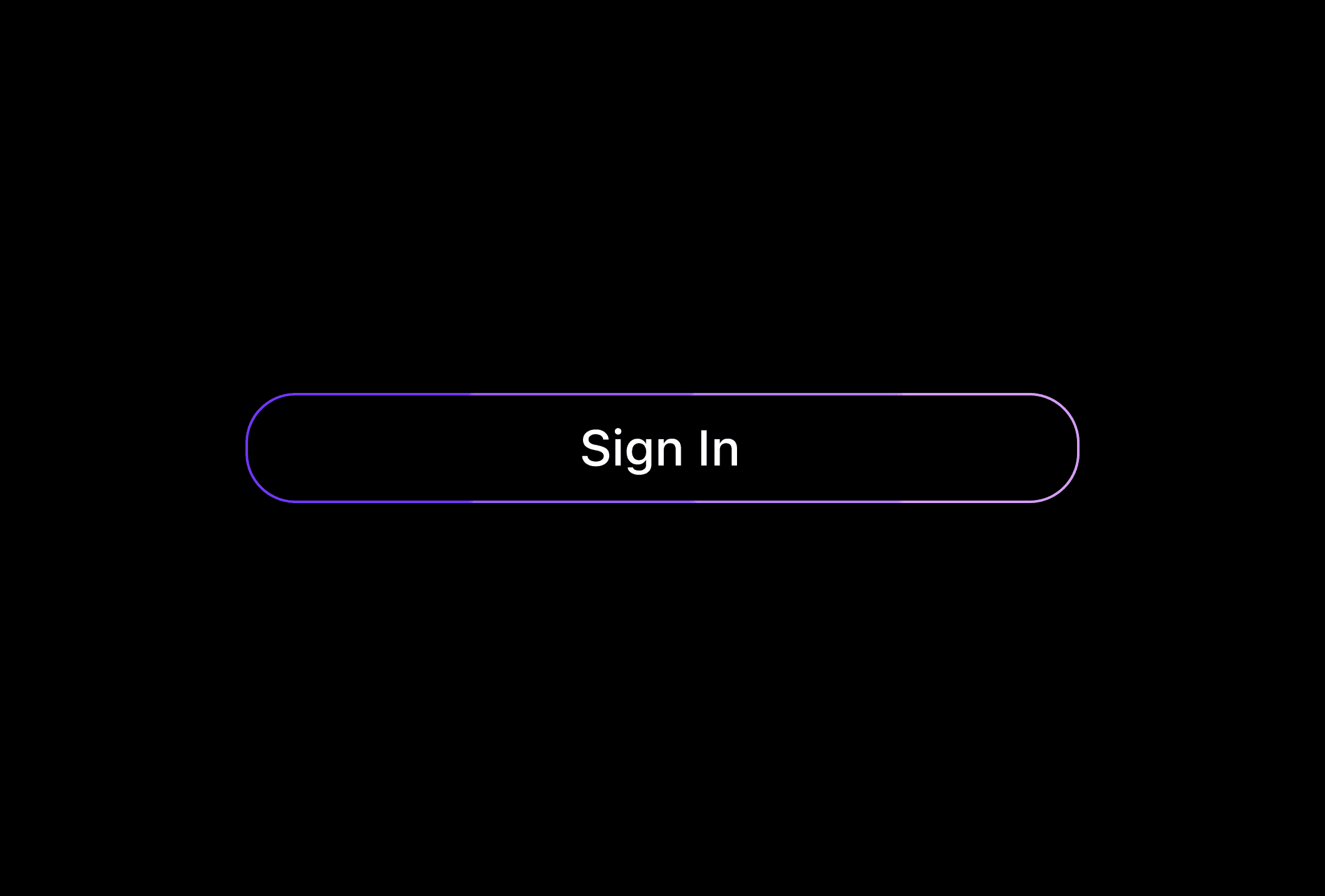
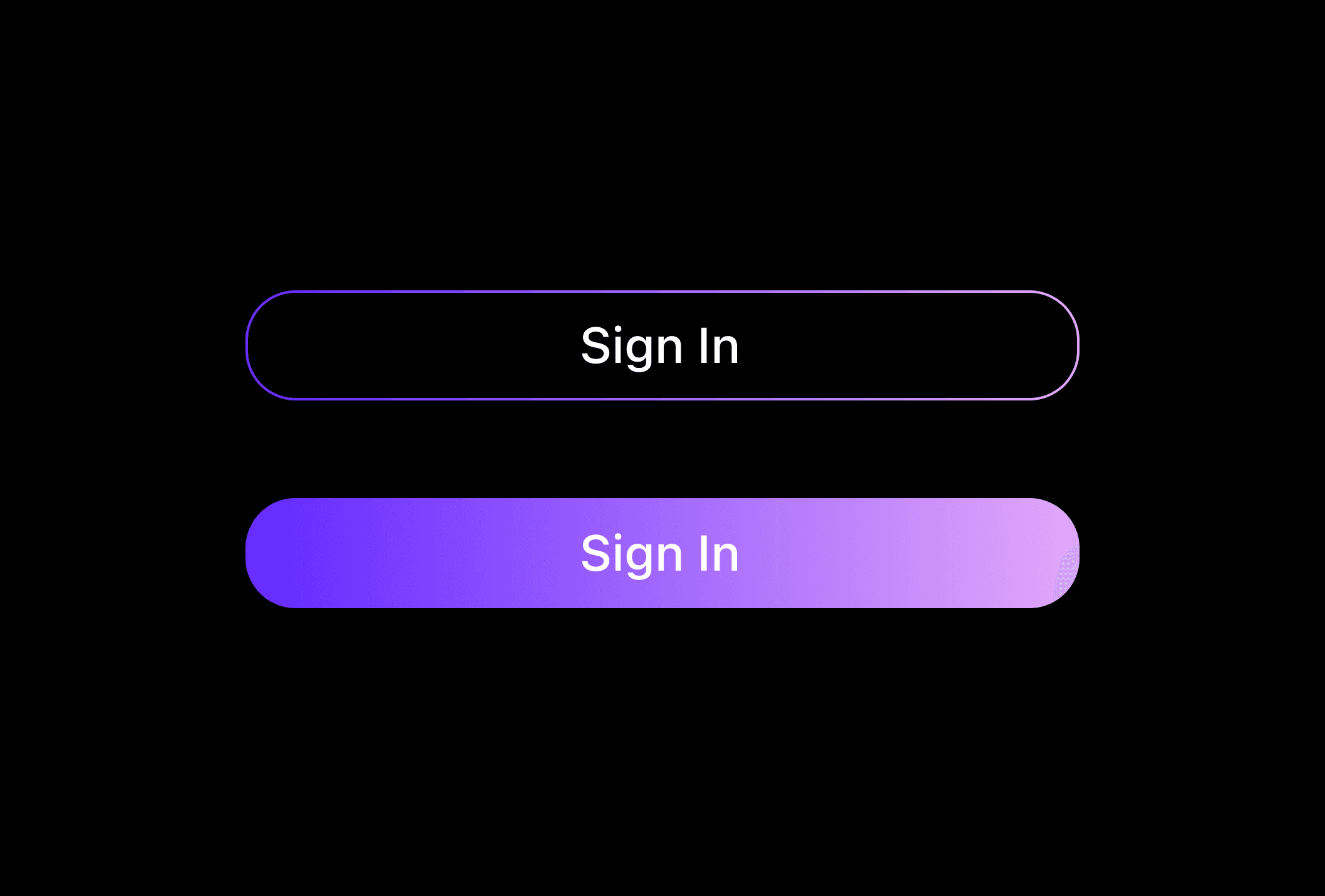
-Sign-In or other basic actions were styled in our key brand gradient, maintaining consistency across
the platform.
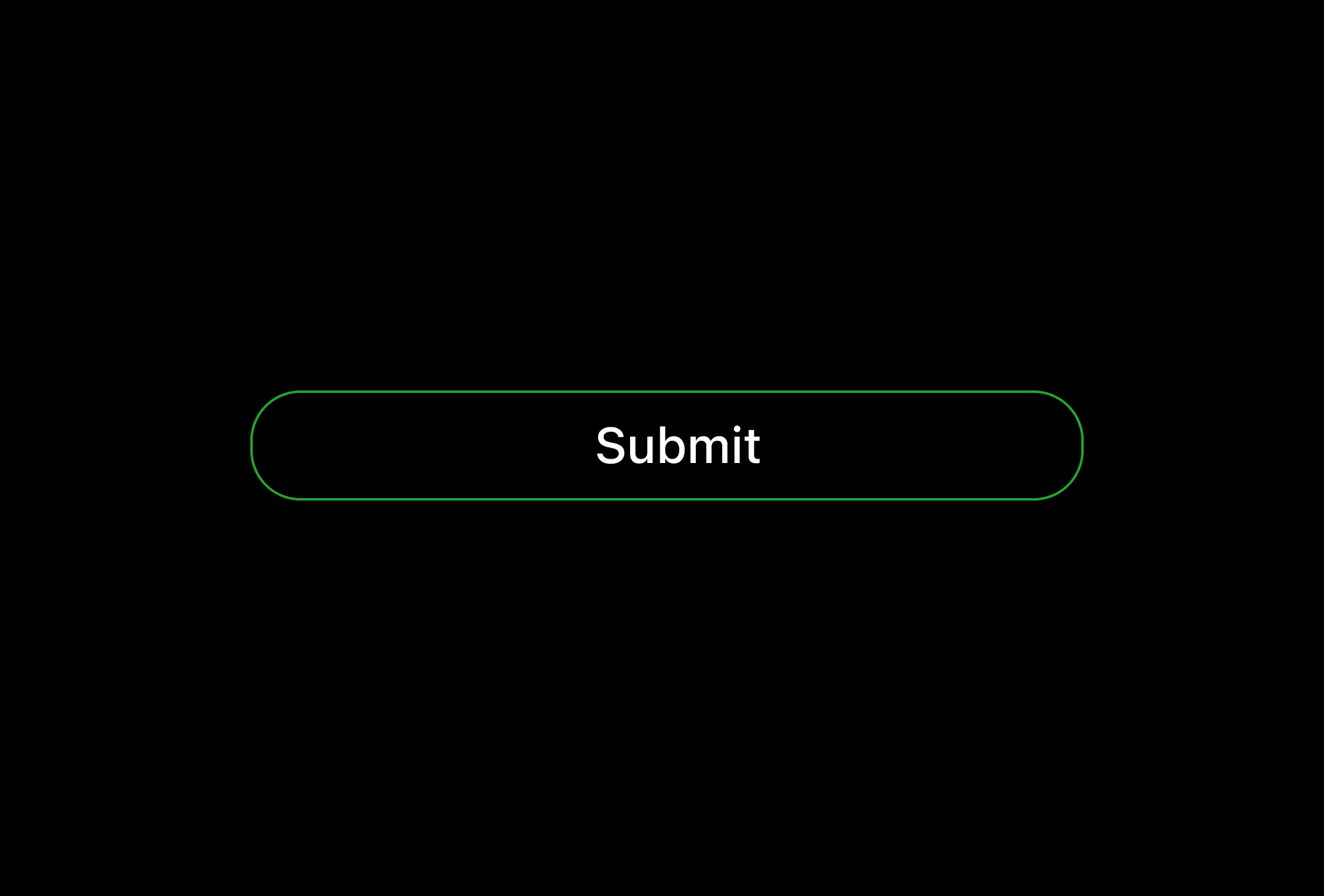
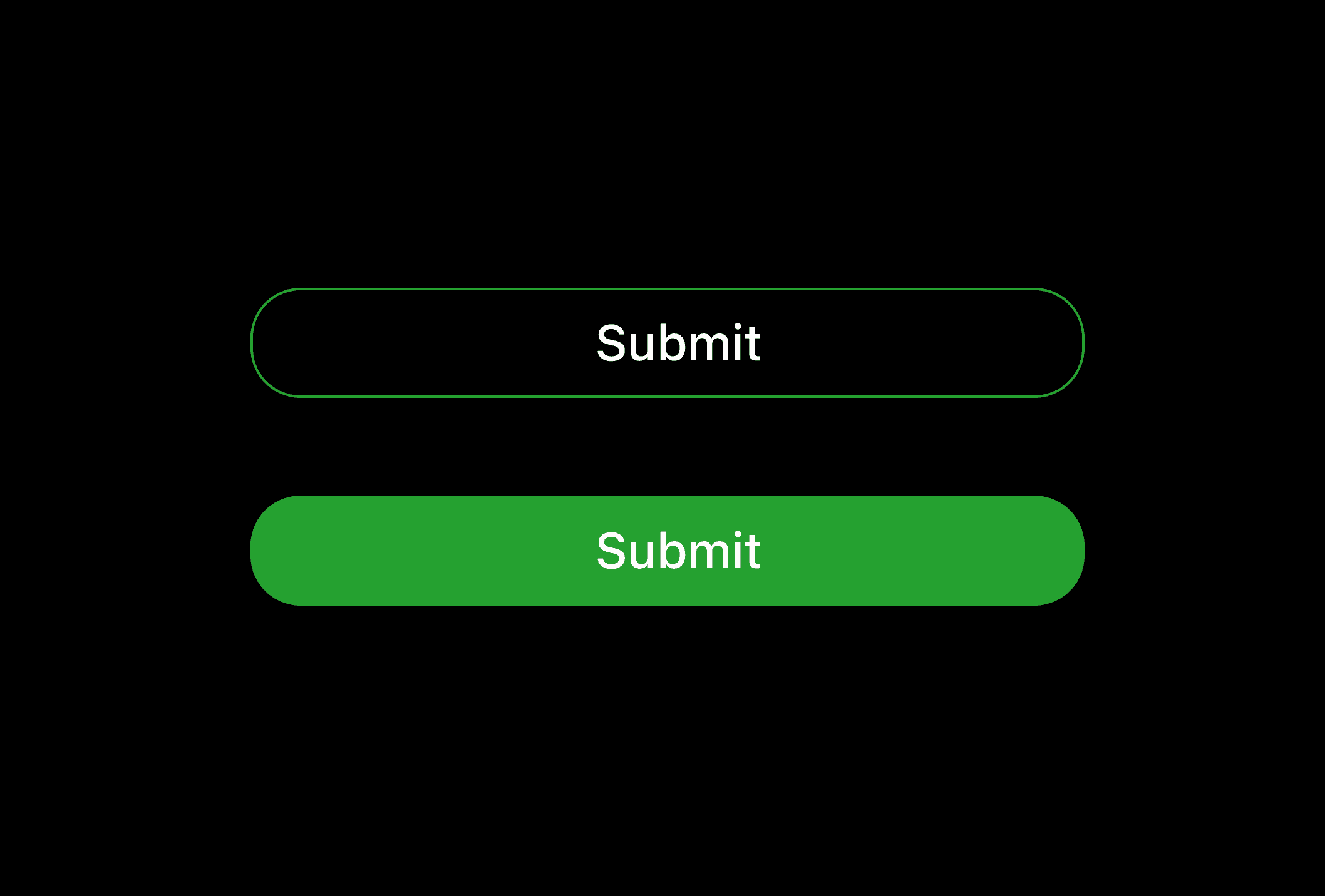
-Submit or Purchase actions were highlighted in green to signify progress or confirmation.
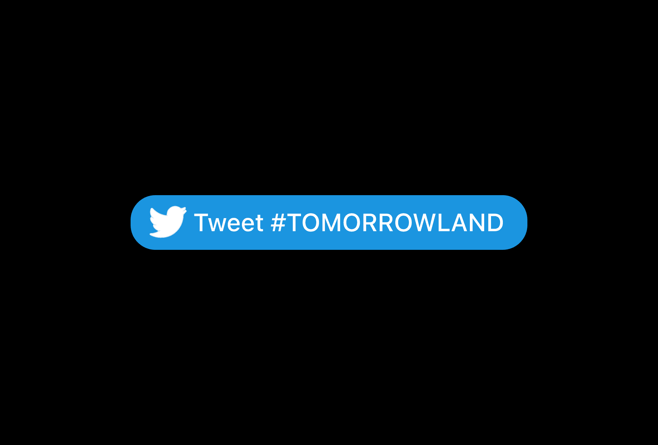
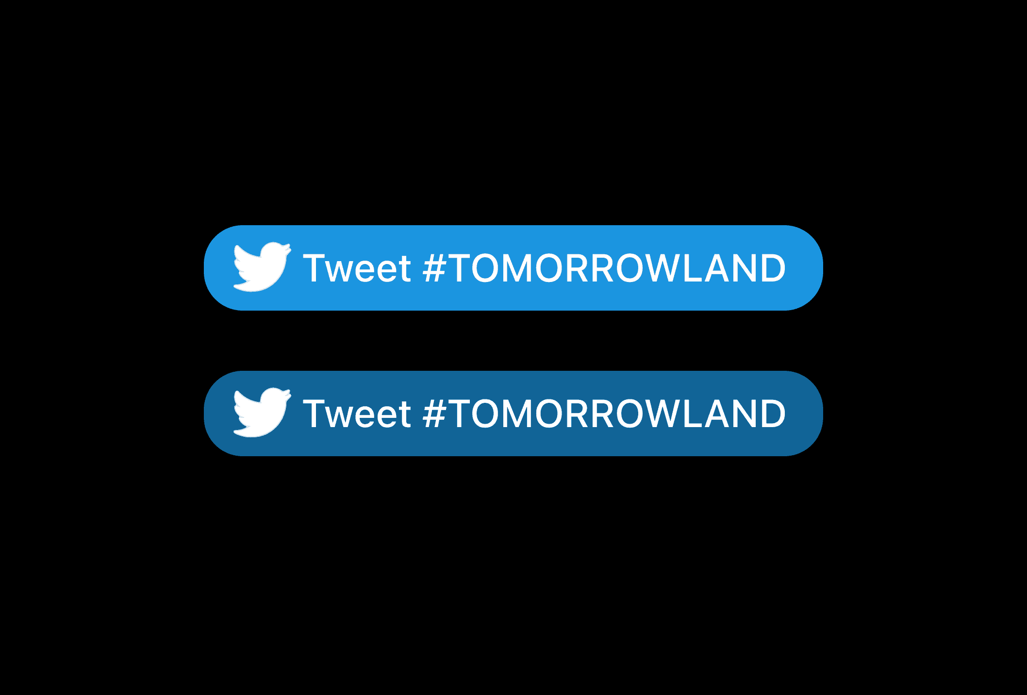
-Twitter-related interactions utilized their signature blue to align with brand identity.
Interactions
Observe how each button responds dynamically when interacted with. To enhance the user
experience, buttons are designed to fill with color or darken when hovered over, providing clear
and satisfying feedback.
Slider Buttons
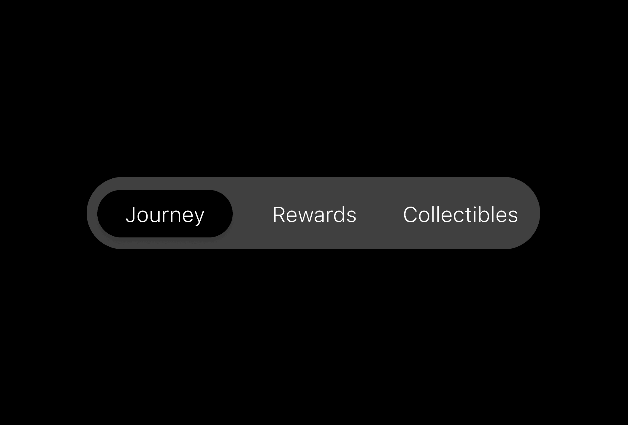
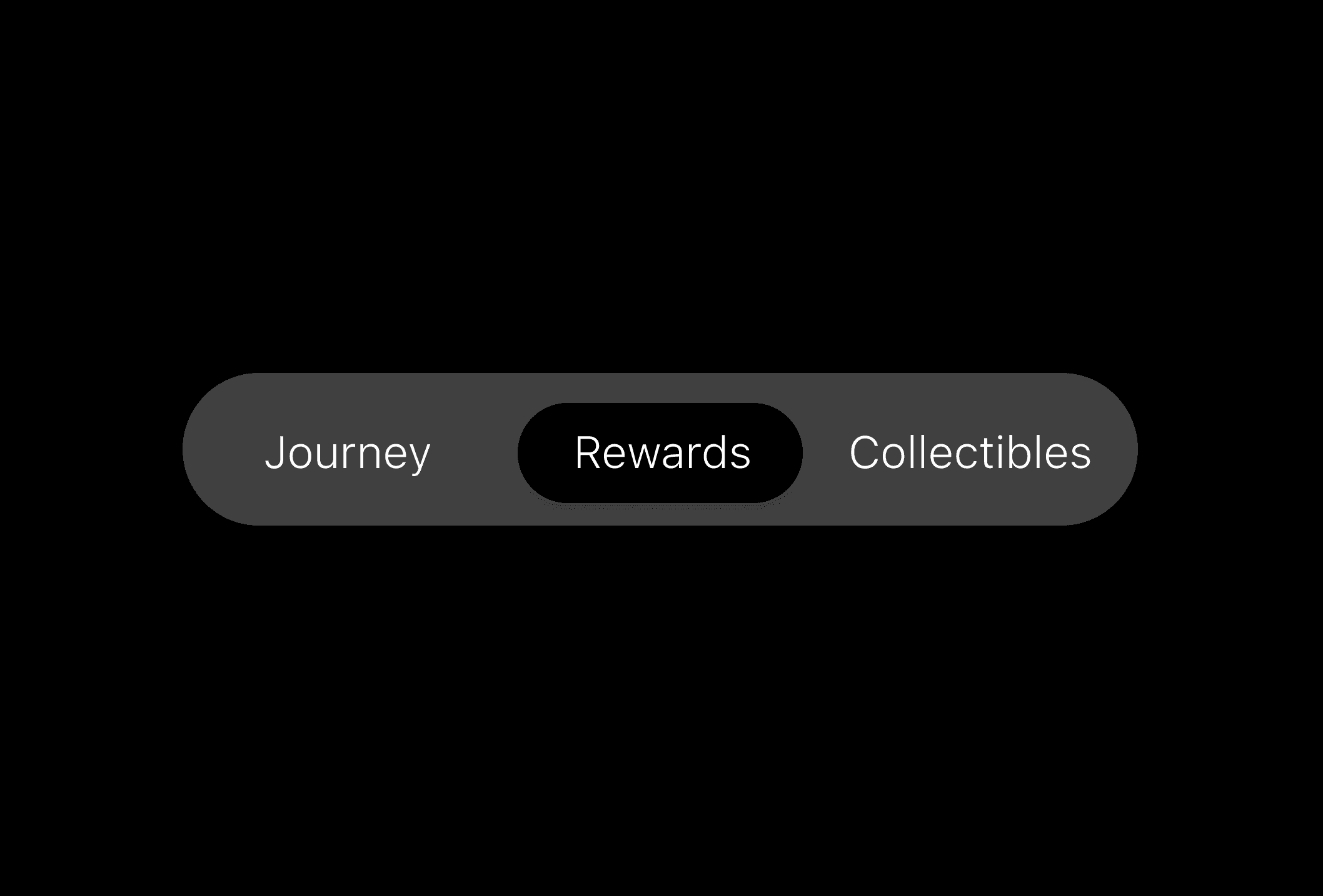
The sliders are designed to provide smooth navigation and an intuitive user experience. When a button
is clicked, the slider seamlessly transitions to the corresponding section, ensuring smooth navigation
& an intuitive user experience. This design not only enhances functionality but also maintains a
polished and cohesive aesthetic.
Accessibility
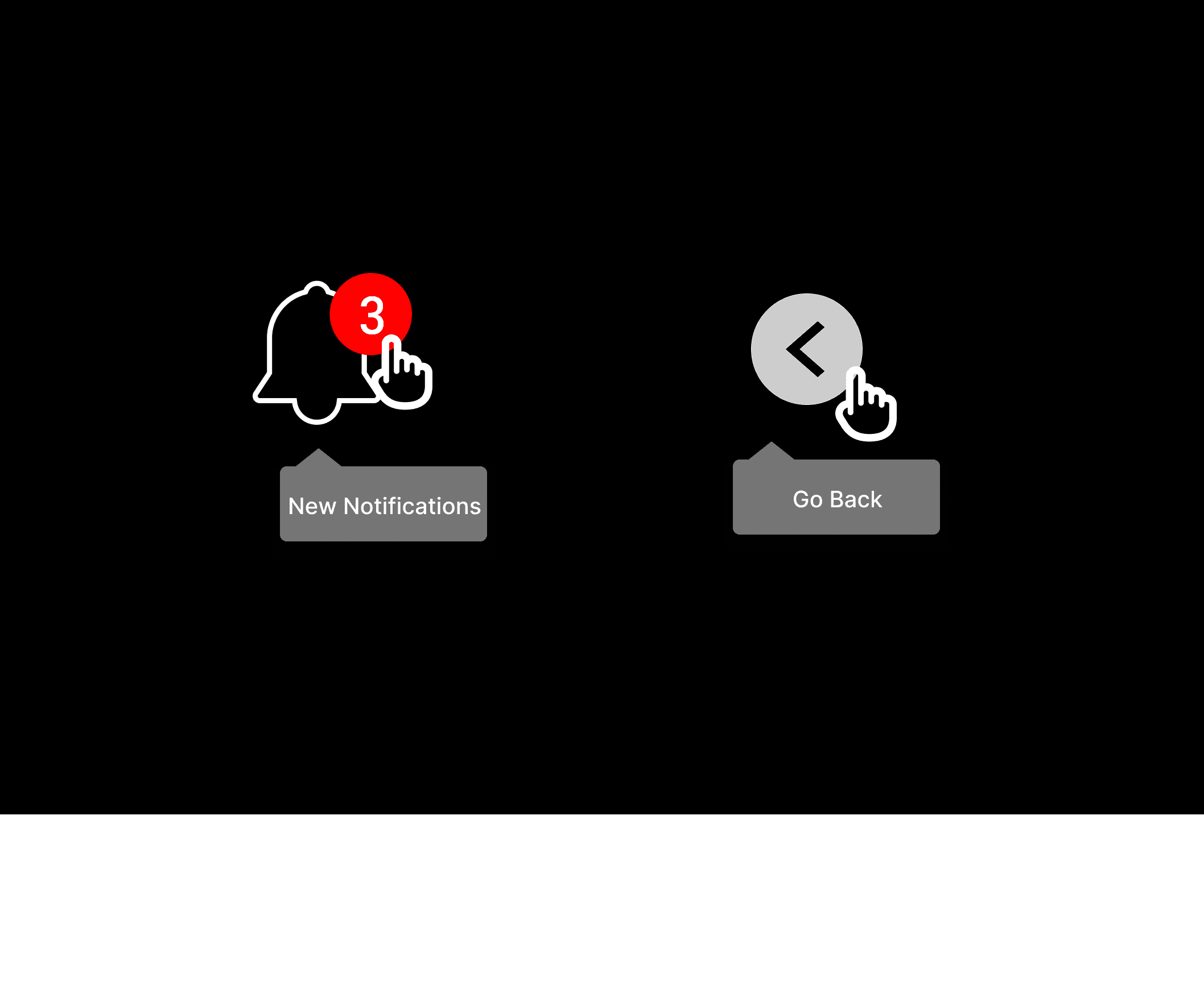
Toggle Button actions & states
Toggle buttons were implemented to clearly indicate the action or outcome associated with each
button when clicked. This helps with accessibility by providing intuitive visual and interactive
feedback, ensuring users can easily understand and navigate the interface, including those
with cognitive or visual impairments.

Buttons
Buttons Trigger a single action. Buttons for MAP3 are used for
key actions, like submitting a response, making a change,
purchasing a ticket or progressing to the next step.
Types
Here are the variations of buttons designed for MAP3, crafted with
a focus on intuitive user interactions. To ensure familiarity and
reinforce user expectations, we employed specific color associations:
-Sign-In with Email, Apple, or Google options were designed with
clean white buttons to ensure simplicity & a seamless experience.
-Sign-In or other basic actions were styled in our key brand gradient,
maintaining consistency across the platform.
-Submit or Purchase actions were highlighted in green to signify
progress or confirmation.
-Twitter-related interactions utilized their signature blue to align with
brand identity.


Slider Buttons
The sliders are designed to provide smooth navigation & an intuitive
user experience. When a button is clicked, the slider seamlessly
transitions to the corresponding section, ensuring smooth navigation
& an intuitive user experience. This design not only enhances
functionality but also maintains a polished and cohesive aesthetic.
Interactions
Observe how each button responds dynamically when interacted with.
To enhance the user experience, buttons are designed to fill with color
or darken when hovered over, providing clear & satisfying feedback.


Accessibility
Toggle Button actions & states
Toggle buttons were implemented to clearly indicate the action or
outcome associated with each button when clicked. This helps with
accessibility by providing intuitive visual and interactive feedback,
ensuring users can easily understand and navigate the interface,
including those with cognitive or visual impairments.


MAP3 Design System
Navigate through the library used
to build the MAP3 Application
Buttons
Buttons trigger a single action. Buttons for MAP3 are used for key actions,
like submitting a response, making a change, purchasing tickets or progressing
to the next step.
Types
Here are the variations of buttons designed for MAP3, crafted with a focus on intuitive user interactions.
To ensure familiarity and reinforce user expectations, we employed specific color associations:
-Sign-In with Email, Apple, or Google options were designed with clean white buttons to ensure
simplicity and a seamless experience.
-Sign-In or other basic actions were styled in our key brand gradient, maintaining consistency across
the platform.
-Submit or Purchase actions were highlighted in green to signify progress or confirmation.
-Twitter-related interactions utilized their signature blue to align with brand identity.


Interactions
Observe how each button responds dynamically when interacted with. To enhance the user
experience, buttons are designed to fill with color or darken when hovered over, providing clear
and satisfying feedback.


Slider Buttons
The sliders are designed to provide smooth navigation and an intuitive user experience. When a button
is clicked, the slider seamlessly transitions to the corresponding section, ensuring smooth navigation
& an intuitive user experience. This design not only enhances functionality but also maintains a
polished and cohesive aesthetic.


Accessibility
Toggle Button actions & states
Toggle buttons were implemented to clearly indicate the action or outcome associated with each
button when clicked. This helps with accessibility by providing intuitive visual and interactive
feedback, ensuring users can easily understand and navigate the interface, including those
with cognitive or visual impairments.

Buttons
Buttons Trigger a single action. Buttons for
MAP3 are used for key actions, like submitting
a response, making a change, purchasing a
ticket or progressing to the next step.
Types
Here are the variations of buttons designed for MAP3,
crafted with a focus on intuitive user interactions. To
ensure familiarity and reinforce user expectations,
we employed specific color associations:
-Sign-In with Email, Apple, or Google options were
designed with clean white buttons to ensure simplicity
& a seamless experience.
-Sign-In or other basic actions were styled in our key
brand gradient, maintaining consistency across the
platform.
-Submit or Purchase actions were highlighted in green
to signify progress or confirmation.
-Twitter-related interactions utilized their signature blue
to align with brand identity.


Interactions
Observe how each button responds dynamically
when interacted with. To enhance the user
experience, buttons are designed to fill with color
or darken when hovered over, providing clear
and satisfying feedback.


Slider Buttons
The sliders are designed to provide smooth
navigation & an intuitive user experience. When
a button is clicked, the slider seamlessly
transitions to the corresponding section,
ensuring smooth navigation & an intuitive user
experience. This design not only enhances
functionality but also maintains a polished and
cohesive aesthetic.


Accessibility
Toggle Button actions & states
Toggle buttons were implemented to clearly
indicate the action or outcome associated with
each button when clicked. This helps with
accessibility by providing intuitive visual and
interactive feedback, ensuring users can easily
understand and navigate the interface, including
those with cognitive or visual impairments.
