MAP3 Design System
Navigate through the library used
to build the MAP3 Application
Iconography
Icons visually represent concepts, objects, or actions, serving a specific purpose
within a layout. They should always be clear, functional, and easy to understand.
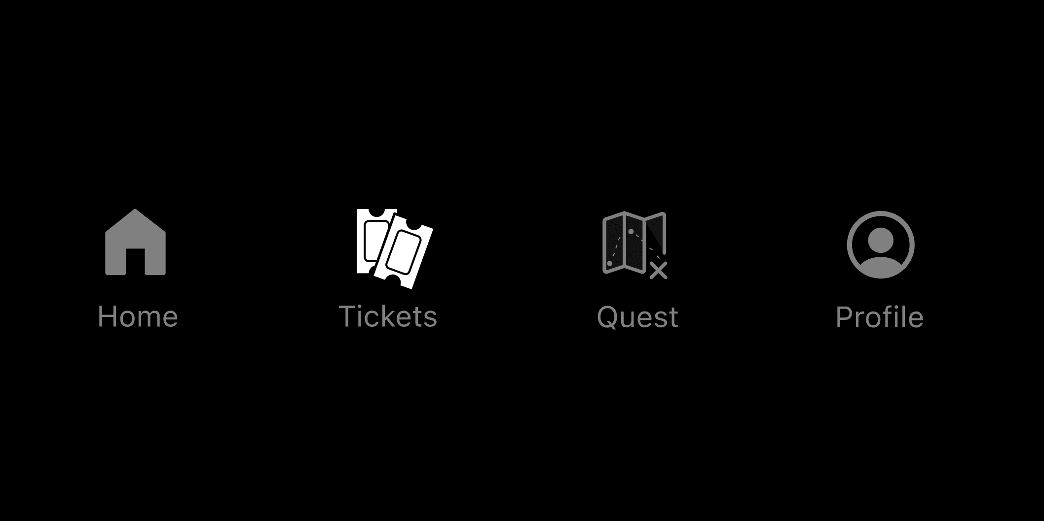
Navigation Icons
These are the icons used for the navigation bar. When hovered on they will fill in with white.
-Home represented by a house
-Tickets with a ticket icon
-Quest shown with a map
-Profile with a head icon
Main Icons
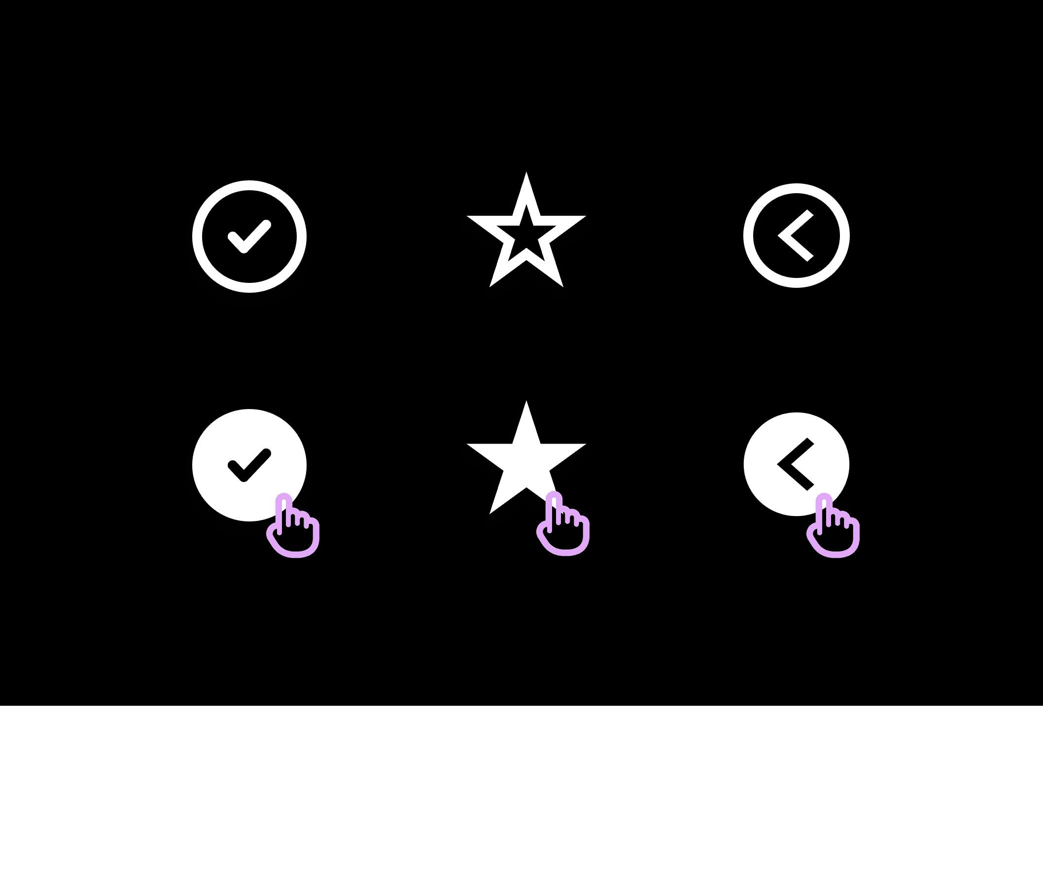
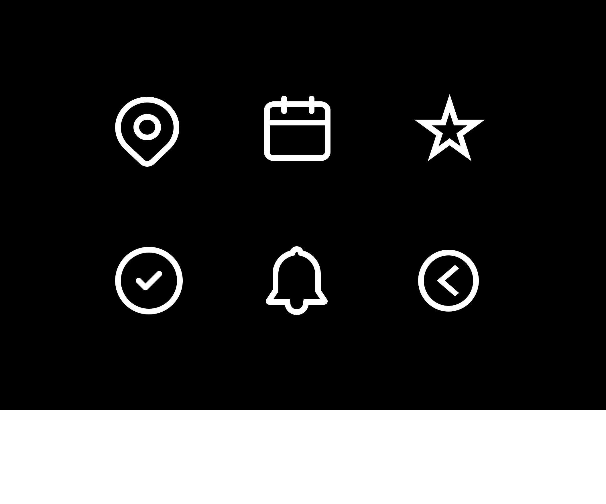
These are the primary icons used throughout the app, including stars, checkmarks, and stamps.
Each icon features a bold stroke to ensure they stand out.
Interactions
The icons are designed to provide a dynamic and engaging user experience. As you hover over
an icon, it smoothly fills in, highlighting its interactive nature. This seamless transition not only
enhances usability but also adds a polished and cohesive visual appeal to the design.

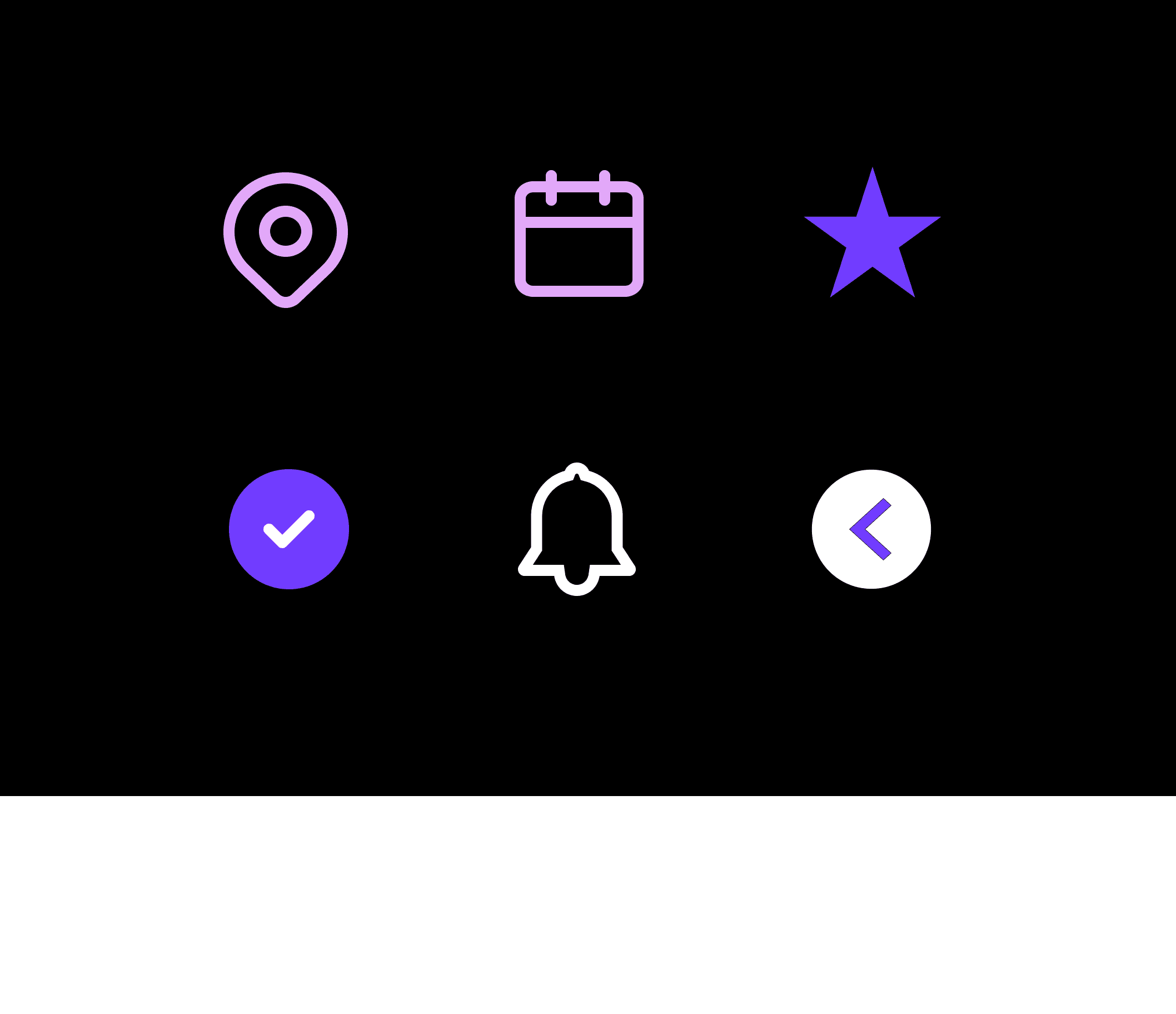
Final Icon Colors
Here, you’ll find the recommended colors for each icon, drawn from our primary color palette.
These selections are designed to add vibrancy and energy to the overall design.

Accessibility
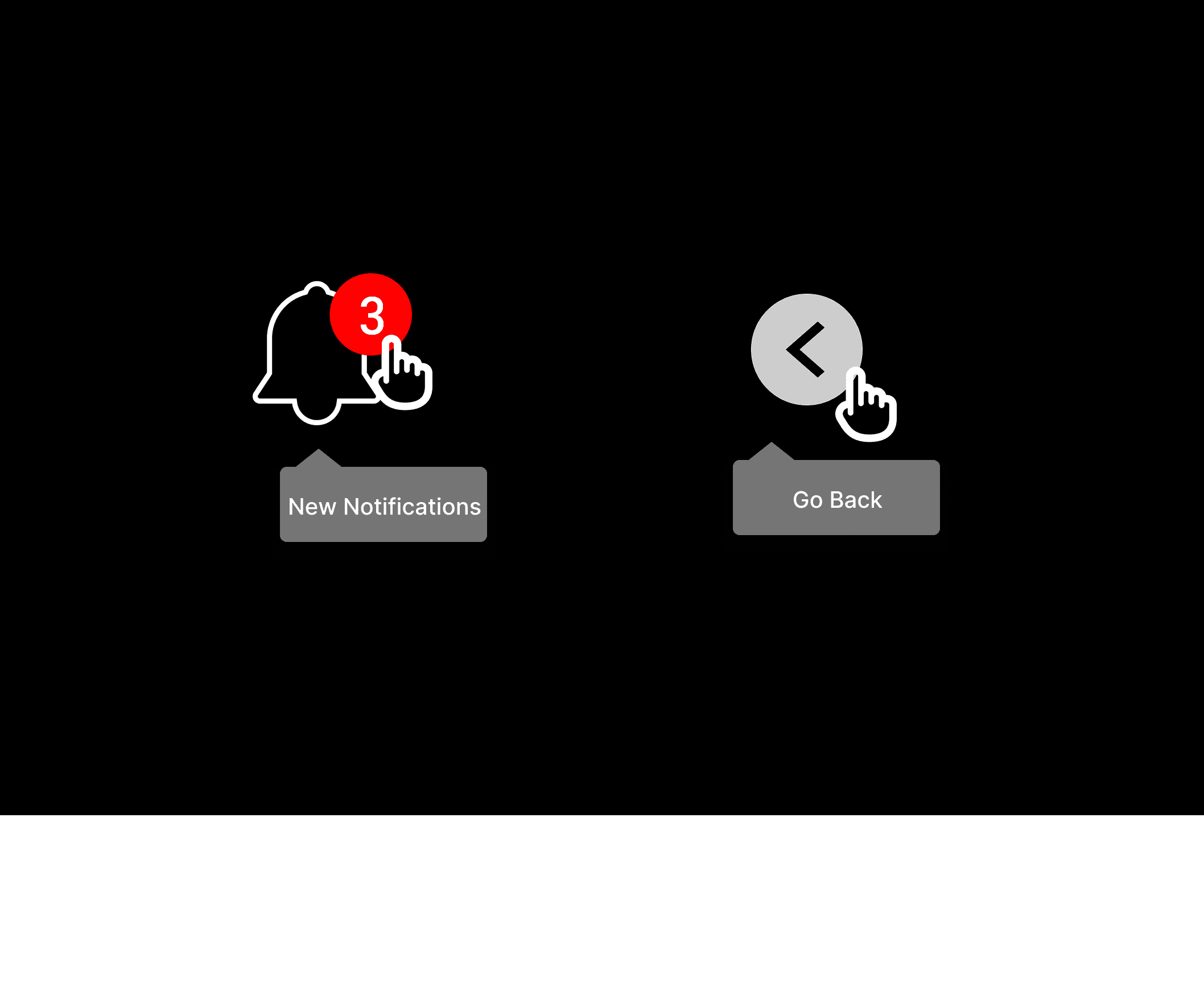
Toggle Icon actions & states
Toggle icons were implemented to clearly indicate the action or outcome associated with each
icon when clicked. This helps with accessibility by providing intuitive visual and interactive
feedback, ensuring users can easily understand and navigate the interface, including those
with cognitive or visual impairments.

Iconography
Icons visually represent concepts, objects, or actions, serving
a specific purpose within a layout. They should always be clear,
functional, and easy to understand.
Navigation Icons
These are the icons used for the navigation bar. When hovered on
they will fill in with white.
-Home represented by a house
-Tickets with a ticket icon
-Quest shown with a map
-Profile with a head icon

Interactions
The icons are designed to provide a dynamic and engaging
user experience. As you hover over an icon, it smoothly fills
in, highlighting its interactive nature. This seamless transition
not only enhances usability but also adds a polished and
cohesive visual appeal to the design.

Final Icon Colors
Here, you’ll find the recommended colors for each icon, drawn
from our primary color palette. These selections are designed
to add vibrancy and energy to the overall design.
Accessibility
Toggle Icon actions & states
Toggle icons were implemented to clearly indicate the action or
outcome associated with each icon when clicked. This helps
with accessibility by providing intuitive visual and interactive
feedback, ensuring users can easily understand and navigate
the interface, including those with cognitive or visual impairments.
Main Icons
These are the primary icons used throughout the app, including
stars, checkmarks, and stamps. Each icon features a bold stroke
to ensure they stand out.


MAP3 Design System
Navigate through the library used
to build the MAP3 Application
Iconography
Icons visually represent concepts, objects, or actions, serving a specific purpose
within a layout. They should always be clear, functional, and easy to understand.
Navigation Icons
These are the icons used for the navigation bar. When hovered on they will fill in with white.
-Home represented by a house
-Tickets with a ticket icon
-Quest shown with a map
-Profile with a head icon

Main Icons
These are the primary icons used throughout the app, including stars, checkmarks, and stamps.
Each icon features a bold stroke to ensure they stand out.

Interactions
The icons are designed to provide a dynamic and engaging user experience. As you hover over
an icon, it smoothly fills in, highlighting its interactive nature. This seamless transition not only
enhances usability but also adds a polished and cohesive visual appeal to the design.

Final Icon Colors
Here, you’ll find the recommended colors for each icon, drawn from our primary color palette.
These selections are designed to add vibrancy and energy to the overall design.

Accessibility
Toggle Icon actions & states
Toggle icons were implemented to clearly indicate the action or outcome associated with each
icon when clicked. This helps with accessibility by providing intuitive visual and interactive
feedback, ensuring users can easily understand and navigate the interface, including those
with cognitive or visual impairments.

Iconography
Icons visually represent concepts, objects, or
actions, serving a specific purpose within a
layout. They should always be clear, functional,
and easy to understand.
Navigation Icons
These are the icons used for the navigation bar.
When hovered on they will fill in with white.
-Home represented by a house
-Tickets with a ticket icon
-Quest shown with a map
-Profile with a head icon

Main Icons
These are the primary icons used throughout the
app, including stars, checkmarks, and stamps.
Each icon features a bold stroke to ensure they
stand out.
Interactions
The icons are designed to provide a dynamic and
engaging user experience. As you hover over an
icon, it smoothly fills in, highlighting its interactive
nature. This seamless transition not only enhances
usability but also adds a polished and cohesive
visual appeal to the design.
Final Icon Colors
Here, you’ll find the recommended colors for each
icon, drawn from our primary color palette. These
selections are designed to add vibrancy and energy
to the overall design.

Accessibility
Toggle Icon actions & states
Toggle icons were implemented to clearly indicate
the action or outcome associated with each icon
when clicked. This helps with accessibility by
providing intuitive visual and interactive feedback,
ensuring users can easily understand and navigate
the interface, including those with cognitive or
visual impairments.
